Design System
Updated 9th May, 2026
Increasing our team's output by 30%
We built a comprehensive and detailed design system to bring consistency across our product. It serves as a single source of truth, helping the team work faster, stay aligned, and maintain a unified look and feel.

Role
Lead Designer
Duration
Apr '24 - May '25
Team
1 Senior Designer
3 Mid-level Designers
2 Junior Designers
Impact on our workflow
30%
Reduction in new screen design time
25%
Faster Iteration on new requirements
35%
Faster design to dev handoffs
Why we decided to build it?
In a fast-moving startup like ours, speed often outweighed polish. But with frequent iterations, we started facing inconsistency. It became hard to track what worked and what didn’t.
Old design
Before the design system, the product lacked consistency, components were unstructured, design patterns varied across screens. Developers had no clear source of truth, and there was no proper handoff process in place.

Getting started
To get inspired, we looked outward, particularly at how other companies were approaching their design systems, with a strong focus on B2B SaaS products.


Laying the foundations
We took a step back to reassess the basics, tweaking certain elements and aligning others with widely accepted industry standards. This foundational work was essential to ensure that everything we built on top would be consistent, scalable, and easy to maintain in the long run.
Component audit
Since the product had evolved significantly with new features, UI changes, and multiple iterations, our old designs no longer reflected how the product actually looked or functioned. This audit helped us identify gaps, inconsistencies, and outdated patterns that needed to be rethought or rebuilt from the ground up.
Featuring tokens
We studied how tokens were structured, categorized, and mapped to components, learning how they could bring consistency, scalability, and flexibility to both design and code.
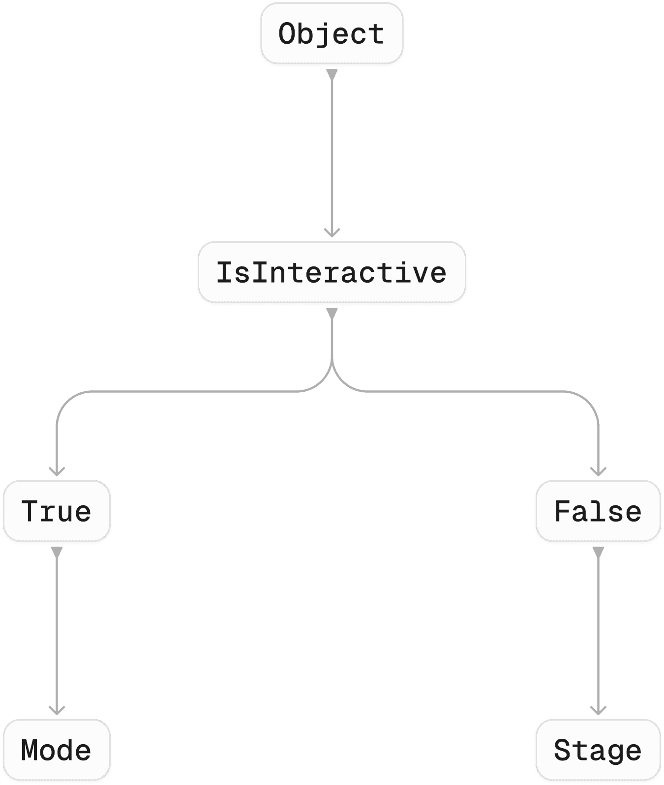
Referencing tokens
Once we finalized our token structure, we began organizing variable collections into three levels: Primitive, Global, and Semantic.

Variables collection in Figma:

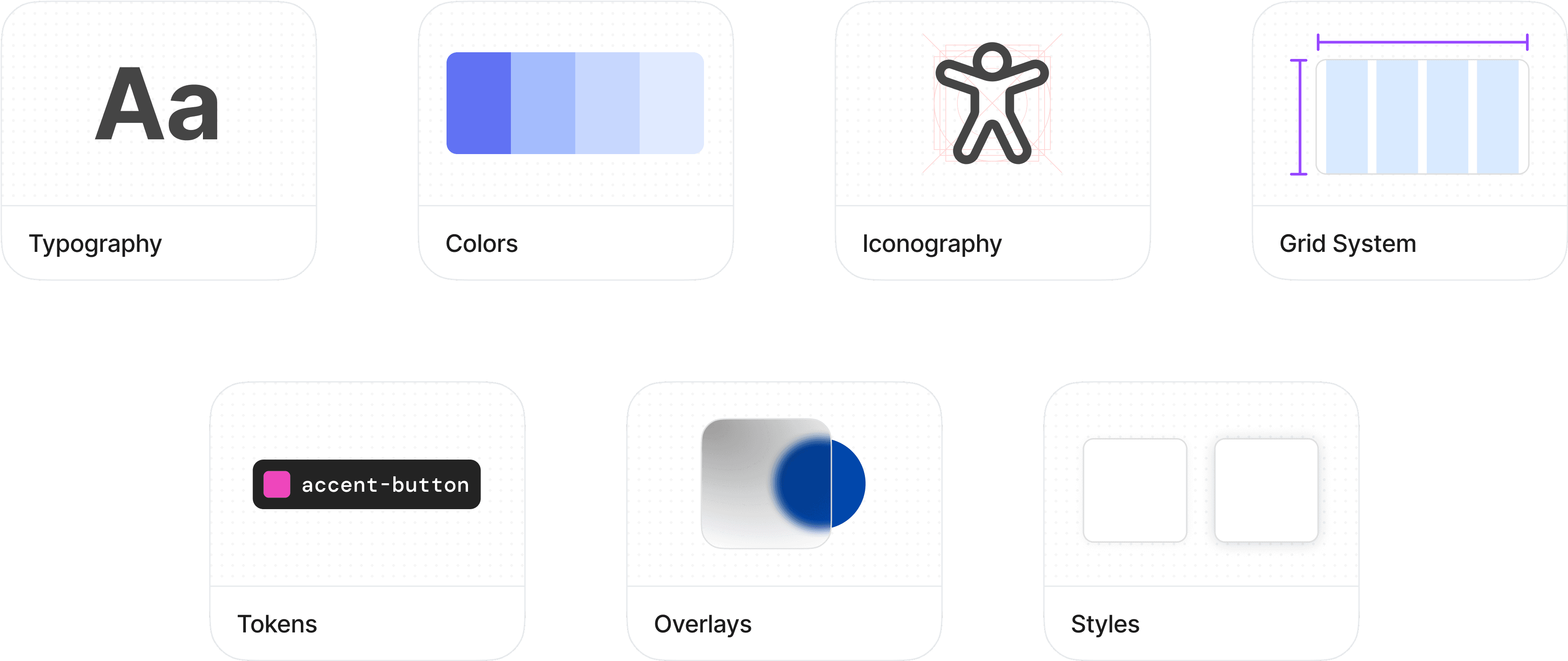
Structuring components
We followed an atomic design approach, this ensured consistency at every level, from foundational elements like buttons and inputs to fully composed layouts, making the system more scalable and easier to maintain.
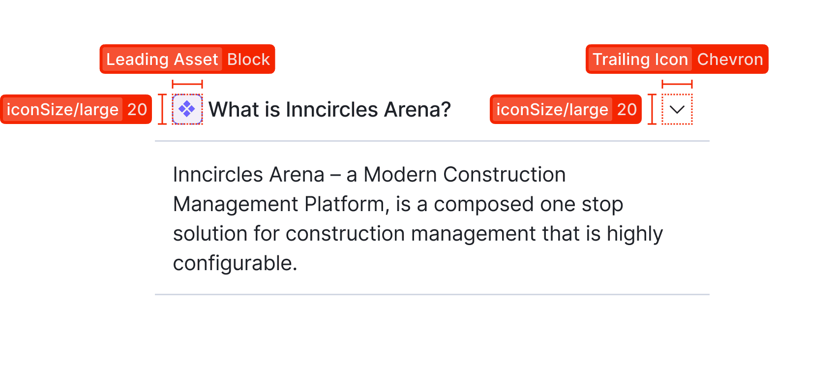
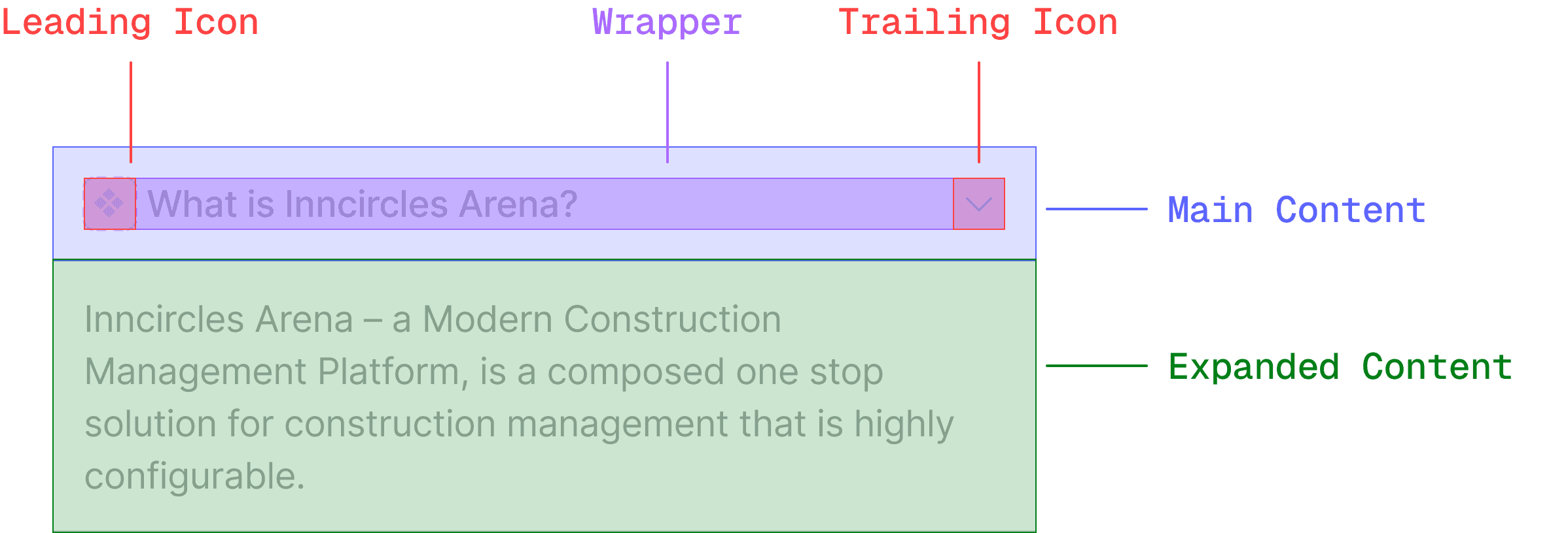
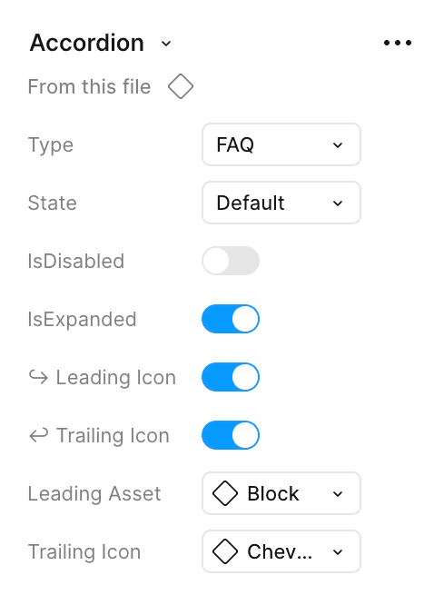
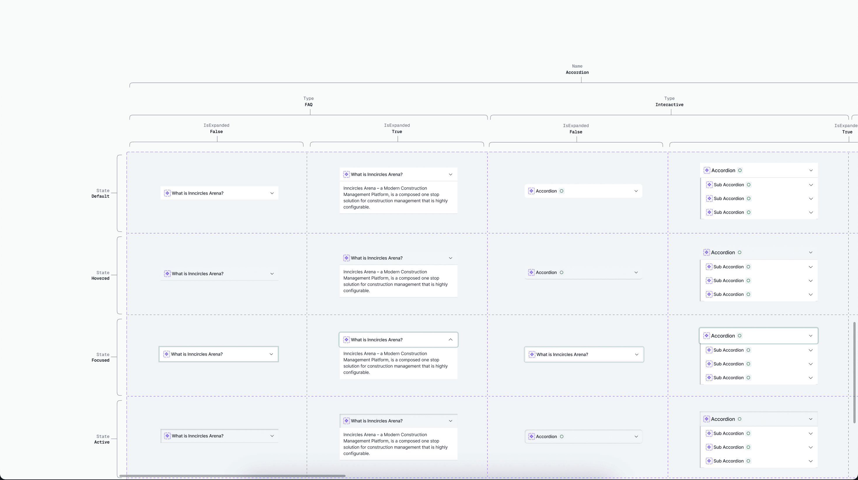
Component Anatomy
We focused on building components flexible enough to cover most scenarios, reducing the need to detach them while designing screens, and maintaining consistency throughout the system.
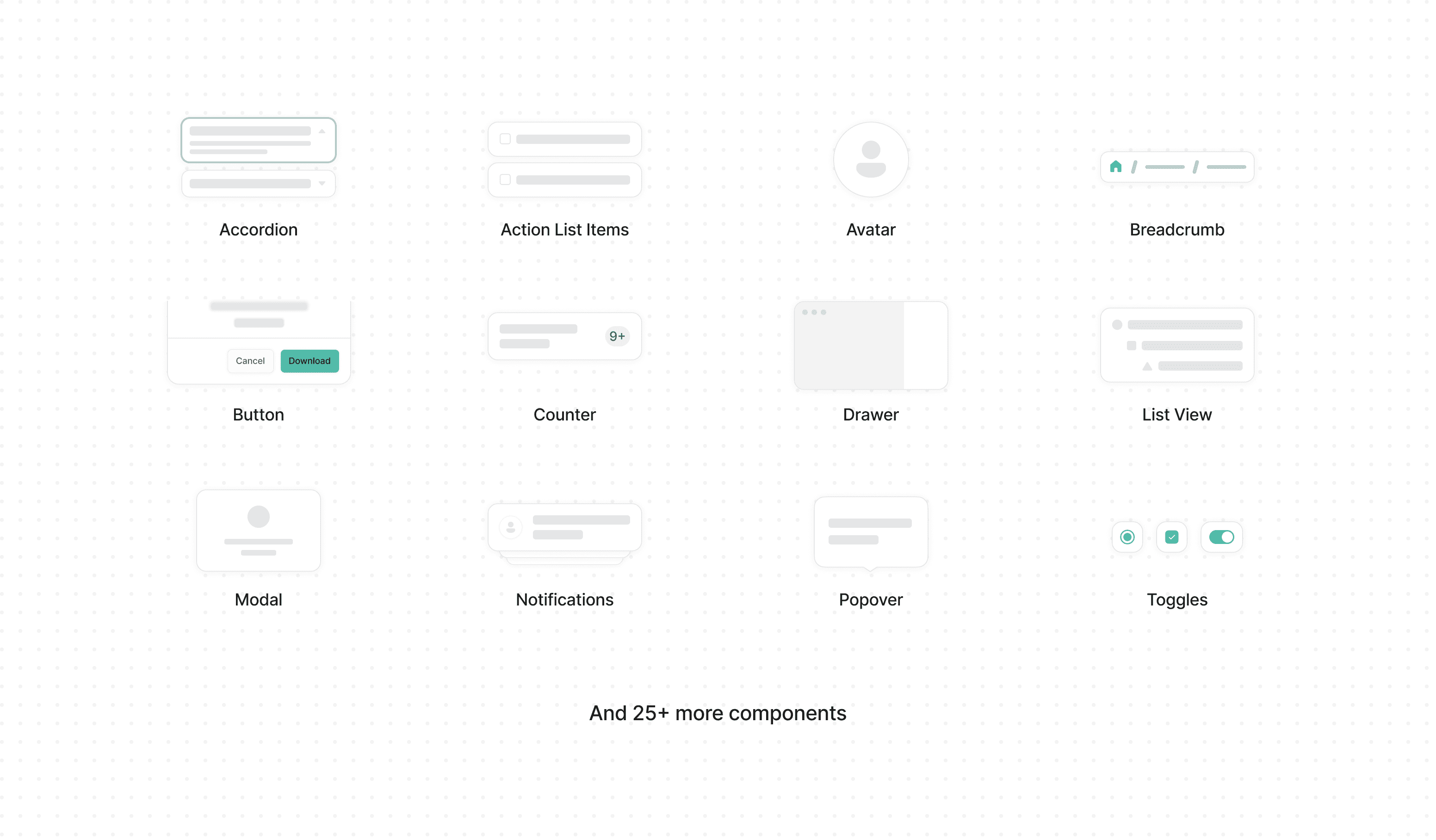
Creating more variants based on the use cases:
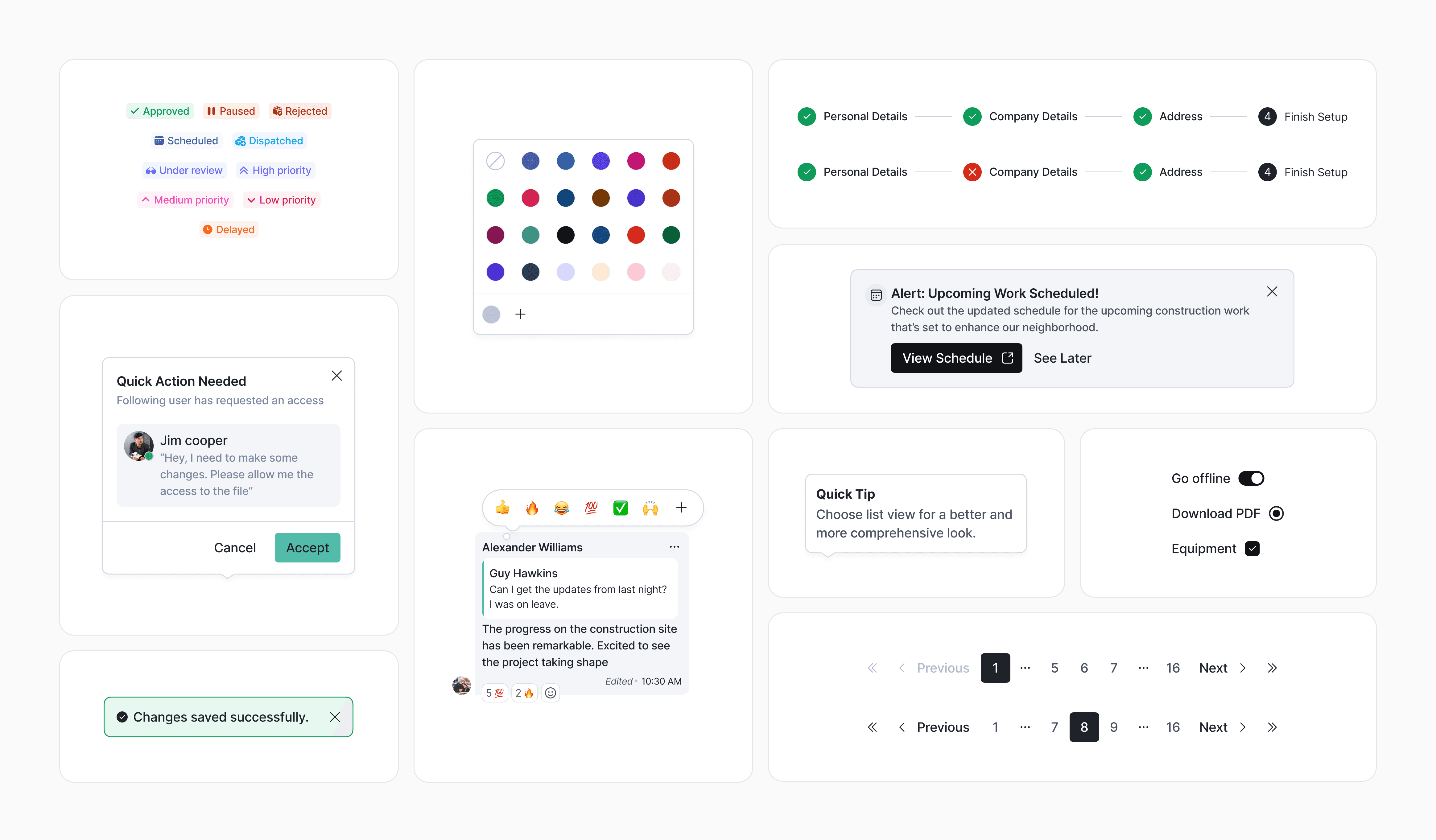
Crafting rest of the components:
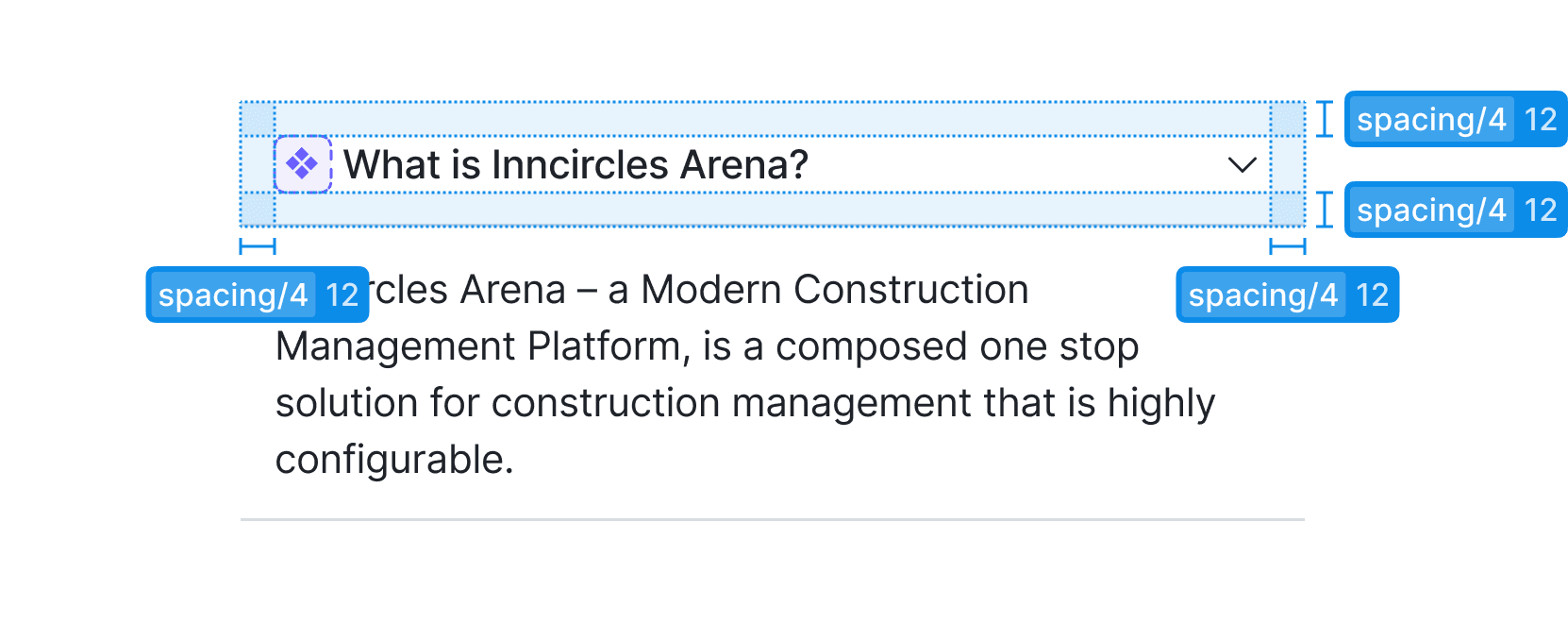
Documenting elements for dev hand-off:


New screens after the implementation of design system:
Fully structured on components
Variables applied
Dev-mode friendly

Some visual explorations that I did for login & sign-up pages.
Challenges
One of our biggest challenges was standardizing components across a complex product while ensuring they stayed flexible for multiple use cases without compromising consistency, which required close collaboration and careful decision-making.
Learnings
The process wasn’t linear, we iterated constantly as new challenges emerged. This reinforced the need for a clear blueprint and roadmap to reduce rework, align the team, and evolve the system with purpose.
Future Scope
Looking ahead, we aim to scale the design system further by introducing full dark mode support and maintaining consistency as the product evolves, ensuring it stays flexible and future-ready with every new feature.